Everything You Need to Know About Responsive Logo Design
Shrinking screen sizes, emerging technologies, and new marketing channels: They all point to one thing. In the modern day, designers need to create logos that are responsive. In this article, we’re going to explain how to do just that.

As designers, we’re well aware of the power of a great logo. Ask a pedestrian on the street to draw the Nike icon, and they’ll instantly curve their pencil into a swoosh. Tell a fifth-grader to create the McDonald’s logo, and we bet they’ll have no trouble finding the yellow paint.
A quality logo acts as shorthand for a company’s values. Get it right, and we set a business up for success. Miss the mark, and we risk making a client’s brand look unprofessional and outdated.
Trouble is, ‘getting it right’ isn’t as straightforward as it once was. In fact, designing a brand’s logo is harder today than it’s ever been. There. We said it.
Nowadays, designers need to adapt their logos for dozens of different platforms, browsers, and audiences. In short, they need to make their logos ‘responsive’.
But what is a ‘responsive logo’, why does it matter, and how can you create them for your clients? In this article, we’re going to provide you with everything you need to know to add responsive logo design to your repertoire.
What is a responsive logo?
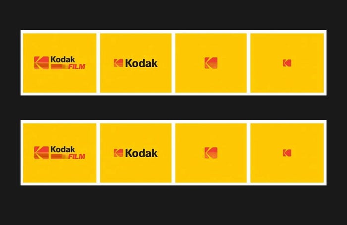
Have you ever viewed a company logo on a smartphone only to find it’s illegible, disproportionate, or messy? Chances are that that business didn’t make their logo responsive.
In its simplest definition, responsiveness describes a brand logo that maintains its clarity in several easily scalable variations.
Having a logo that’s readable on desktop screens and large-scale prints is no longer enough. These days, companies also need symbols that are recognizable on smartphones and as favicons. That means smaller sizes, streamlined ideas, and new designs.
Understanding responsive logos
It’s important to clarify that responsive logo design doesn’t just entail making a logo bigger or smaller. To explain why this is the case, here’s what would happen if we took Heineken’s logo and shrunk it down to fit different screen sizes.
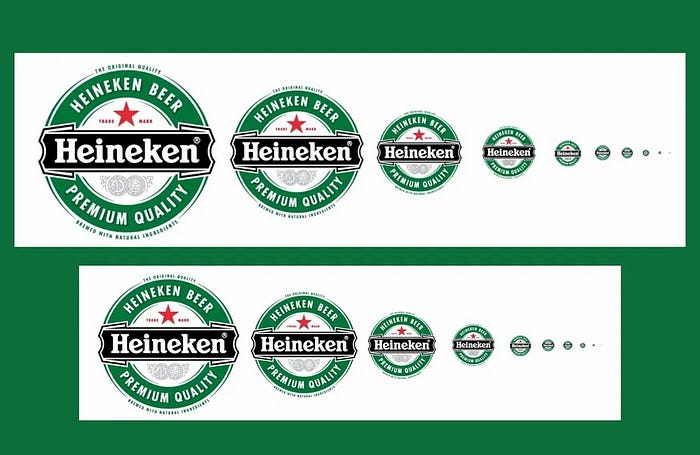
At larger resolutions, this logo looks excellent. It’s clear, easily readable, and attractive. In smaller sizes, however, Heineken’s eye-catching logo becomes illegible.
Designing a responsive logo means creating a new design for every situation by strategically removing elements that aren’t necessary to communicate a brand’s message. Here’s how Heineken actually adapts its logo for responsiveness.
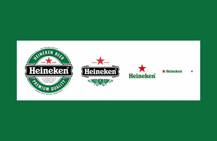
To make Heineken’s logo responsive on all platforms, the designer selected arguably the two most essential elements: The ‘Heineken’ name and the brand’s ‘red star’ symbol.
They then created a collection of logos that are easily legible on smaller screen sizes without compromising the brand’s core message.
Why do responsive logos matter?
‘Responsiveness’ is a buzzword that gets thrown around a lot these days. When companies began opting for minimalism and simplifying their logos, we all laughed. Just a few years ago, the idea of a company altering its brand image would be a design taboo.
These days, however, we have little choice but to eat our words. As of October 2023, over 64% of website traffic comes from mobile devices, including smartphones, tablets, and laptops. That means a brand’s logo needs to be fit for purpose on dozens of different platforms and browsers.
But will unresponsive logos really impact a brand’s success? In short, yes. It takes less than two-tenths of a second for consumers to form a first impression about a company’s website. And with users spending over six seconds focused on a brand’s logo, the way a business presents its image is essential when it comes to capturing and converting its customers.
In short, responsive logos are a necessity, and having them in your web design repertoire is essential.
With that out of the way, let’s get into the good stuff, starting with the three core tenets of great responsive logo design.
The 3 Core Tenets of Responsive Logo Design
Creating logos for responsiveness can be a shock to the system for designers. To make the process easier, we’ve broken it down into three fundamental tenets you should follow.
1. Keep it simple
We all love an intricate, well-designed icon, but complexity doesn’t translate well to responsiveness.
Simplicity is the cornerstone of responsive logo design. Having too many elements creates confusion and makes it too hard to adapt an icon for smaller screen sizes. These days, designs need to be clean, streamlined, and modern.
To understand why this is important, take Cracker Barrel’s landing page as an example.

Cracker Barrel’s logo is detailed and exciting — perfect for the front of a restaurant. But on a website? It’s difficult to read, especially the text at the bottom. If you didn’t know what you were looking at, you’d struggle to understand what the symbol was representing.
Now, for a brand that does responsiveness right, take a look at Starbuck’s landing page.

Starbucks spent thousands redesigning its logo for responsiveness back in 2011. The brand removed several elements to hone in on its iconic Siren mascot.
What results is a logo that is symmetrical, clean, flat, and simplistic. It’s just as recognizable on a desktop as it is on a mobile, and that’s the key here.
When creating responsive logos, designers must focus on simplicity. In the digital age, less is always more.
2. Put scalability at the forefront
When creating a brand’s primary logo, it’s vital to design with scalability in mind. Choose a core element, whether it be text or a symbol, that represents the brand’s core values. Then, ensure this element can stand on its own without any additional components to support it. This provides an opportunity to remove the additional layers whenever you need to adapt it to different platforms and contexts.
To explain this concept, here are three brands that have mastered the art of logo scalability.
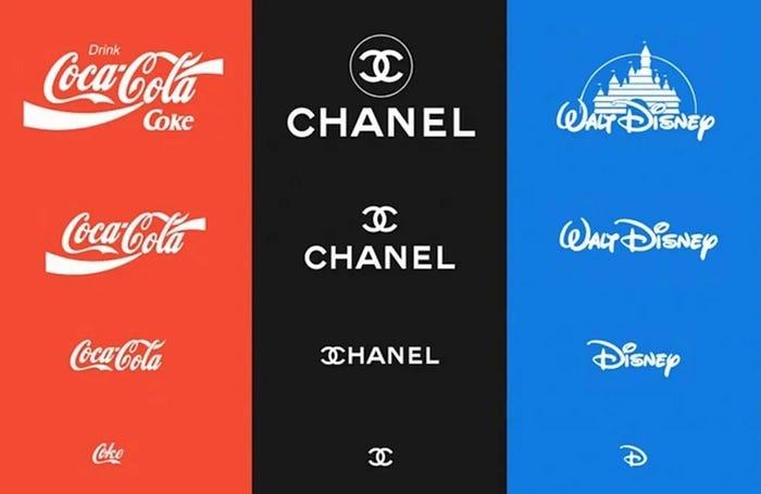
Each of these brands has a ‘core element’ that consumers can recognize without any supporting components.
For Coca-Cola and Disney, the critical component is the typography. These unique font styles are recognizable, even without the extra layers, such as Disney’s castle and Coca-Cola’s flourishes.
For Chanel, the core element is the simple interlaced ‘c’ image. Even without the text, many consumers can still recognize the brand based on this icon alone. Therefore, when scaling down to favicon size, the brand cuts the text and sticks with its iconic symbol.
When we design a logo with a versatile, simple core element, we ensure we can reliably adapt a brand’s image to dozens of different contexts.
Putting scalability at the forefront from the getgo ensures you don’t end up with a great logo that falls short when it comes to time to scale down.
3. Be consistent
While we must design logos that are scalable, it’s also vital to ensure that each new logo variant is consistent with the last.
Whether it’s a print advert, billboard, phone screen, or desktop website, a brand’s logo needs to be recognizable across every medium. Consumers should be able to tell that a logo belongs to a brand, even if it is scaled down, simplified, or decluttered.
When Google opted to design its logo for responsiveness, it faced a unique conundrum. How do you scale down a typographic logo that is already simplified and streamlined? Google’s name is its logo, and the blue ‘G’ alone wouldn’t be recognizable enough out of context.
How did they solve this puzzle? The answer lies in Google’s famous color scheme.

By pairing the standalone ‘G’ with the brand’s trademark primary color scheme, Google created a logo that is perfect for small screens, immediately recognizable, and consistent with the company’s core brand.
When creating logos, every variant must present a visual language that customers can instantly recognize. This incorporates the colors you use, the font styles you choose, and the imagery you portray.
8 Top Tips for Responsive Logo Design
With the three core tenets out of the way, let’s run through eight top tips you can employ when designing responsive logos.
1. Pick your core concept first

All great responsive logos are firmly rooted in one key element. Whether it’s Guinness’s harp, Chanel’s interlinked ‘c’ symbol, or Heineken’s red star, a logo must have one easily scalable, simplistic component that captures the essence of a brand on its own.
Starting with a core concept gives you the freedom to experiment with new ideas and layers of complexity, safe in the knowledge you always have your key element to fall back on when required.
2. Use vector-based designs
How many times have you watched a beautiful image turn into a pixelated mess when it’s resized? Vector graphics solve this problem by allowing designers to scale logos infinitely without compromising their quality. This ensures the core elements of a logo can be adapted to various contexts with any risk of pixelation.
3. Embrace modularity

When logo elements are intertwined, they become difficult to separate. It’s important to create modular logo designs with components that can be edited, rearranged, and removed without affecting other elements. This allows for versatility and encourages scalability. Note how the Heinz logo can easily be broken down into different parts to make new variations.
4. Use color wisely
Gradient designs are out. Duotones and simple block colors are in. It’s crucial to pick a palette that will stand out on all backgrounds, be striking regardless of screen size, and work both in full color and monochrome.
5. Experiment with vertical stacking

One straightforward way to adapt a logo for different platforms is to rearrange and stack the logo vertically. This maintains the brand’s core message while changing the logo’s dimensions to suit different screen sizes. Bang & Olufsen are an excellent example of a brand that employed this tactic effectively.
6. Use negative space to your advantage
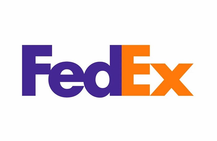
When it comes to creating responsive logos, negative space is a great way to boost the clarity and scalability of your design. Taking advantage of a white background also makes it easier to insert your design into a variety of different formats. The FedEx logo, for example, is legible and attractive in all situations because of its contrasting color palette and use of negative space to form a clean, simple arrow.
7. Choose the right typography
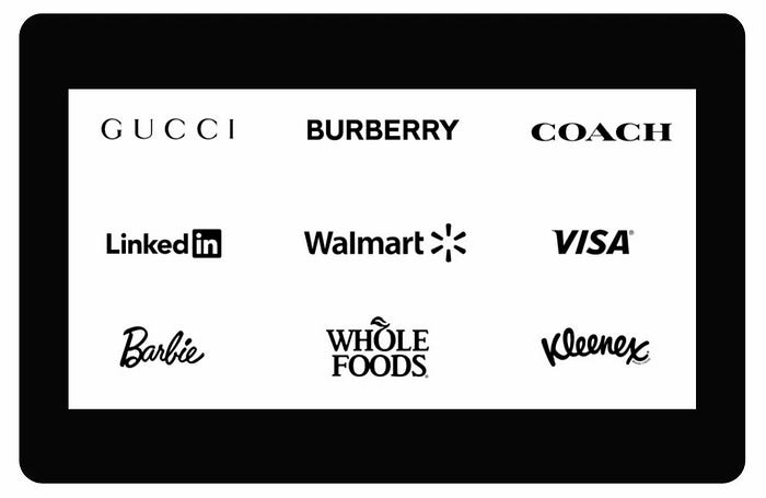
There are dozens of incredible fonts that look outstanding on logos, but this doesn’t make them responsive. Consider legibility when choosing a font. It’s crucial to pick a typeface that will be readable on all devices.
8. Run your own tests
It’s vital to establish a system for assessing responsiveness. Always test how each element of your logo performs in different contexts. Does the color scheme look washed out on mobile? Is that font choice really legible? Routinely testing the functionality of your ideas means you can fine-tune your design before it’s too late.
Wrapping it up: The Future of Responsive Logos
As the digital world continues to grow, the importance of responsive logo design has never been more apparent.
We’re not here to see into the future, but there is one thing we can predict. The versatility of responsive logo design means designers will be ready for anything. New screen size? No problem. Emerging technology? Easy as pie.
As long as we keep it simple, put scalability first, and make modular designs a priority, we can prepare ourselves for everything the future throws at us.
Did you like this guide? Was there something we missed? message us and let us know your thoughts.
