Framer vs. Figma: When should you be using Framer?
It’s important that we stay up to date on design tools and which ones are the best for our use case, but it’s also important for us to keep an eye on tools growing in popularity, ones that we might need to use in the future and we should prepare to use now.
That’s why we need to compare Figma and Framer. You’ve likely spent plenty of time in Figma; it’s practically ubiquitous in the design world. But Framer has been growing in popularity since 2022 alongside it. Why?
This article will focus on Figma and Framer. We’ll explore how they differ as well as when to reach for either of them to improve your UI/UX designer capabilities.
What is Figma?
Any designer worth their salt knows what Figma is, so I’m going to keep its introduction short. Figma is an all-in-one platform where you can design and prototype. What sets Figma apart from other platforms is its emphasis on real-time collaboration and creating a space for design teams to effortlessly create, share, and iterate in the cloud.
What is Framer?
Framer, on the other hand, while also popular, has a different selling point. Much like Figma, it is also a design and prototyping tool whose focus is on creating a better design experience, but it achieves this through microinteractions and animations.
Moreover, you can use real code to customize Framer components, which many other similar platforms don’t do as well. While they share a lot of the same features, Framer is an intuitive tool for designing and publishing responsive websites.
Figma vs. Framer: A comprehensive comparison
User interface and ease of use
Let’s talk about first impressions. Once you use the software, can you easily find what you’re looking for? Can you discover helpful new tools when you need them?
In this area, it can be difficult to give an unbiased impression, because most of us have used Figma for years. But I’ll do my best to view both these platforms with a fresh outlook.
Figma’s intuitive interface
Figma has one of the most intuitive and easy-to-use UIs in the game right now. While I can’t speak for everyone, even though I started with Adobe XD, Figma has been one of the easiest applications to jump into. Moreover, with the large amounts of free tutorials online, Figma is a definite recommendation for beginners:
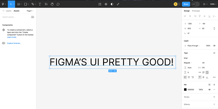
The component library, also known as variants, makes it easy to organize all your design components, removing multiple copies of the same components or grouping them within the library. The instance swap push menu allows individuals to easily browse through components and move between the different groups and libraries. This is especially important when multiple people are collaborating on one project because things get very disorganized very quickly.
Framer’s interface and learning curve
Framer, unlike other standard UI/UX design tools, has more of a focus on the prototyping and ultimately publishing of websites with more complex interactions, animations, and transitions. These sophisticated features make the learning curve for this platform steeper than more standard design platforms like Figma, but not by much:
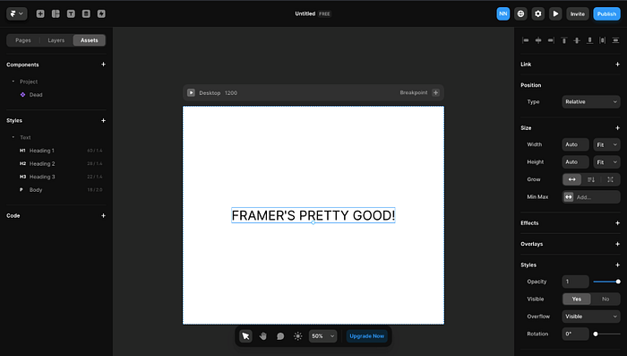
The UI itself is friendly and not too different from other design platforms, including a push menu on the left for viewing components and design elements on the left. Any experienced designer won’t have trouble figuring things out, and as for beginners, there are multiple tutorials out there that will put you up to speed pretty fast.
A feature that I personally think is really cool and showcases the platform’s focus on complex interactions and animations is the animated light and dark mode button at the bottom. Figma also has light and dark modes, but it doesn’t have a cool button animation to go with it — one point for Framer in the microinteractions department!

Collaboration features
Gone are the days when we had to send iterations back and forth to get anything done. Both tools can be collaborative, but one has a clear edge in this area.
Figma’s real-time collaboration
Figma is a multipurpose design tool with a focus on the efficiency of collaborative design. Whether it’s designing, wireframing, or prototyping, Figma makes it easy for teams to collaborate on projects in real-time. No need for multiple handoffs or renaming your design for the millionth time (seriously, one time I had a design named designV2-final-final-Complete.fig):

This allows multiple people to work on one project at the same time, be it designers working on UI, developers working on a piece of code, or different iterations being prototyped all at once on the same project. To foster further collaboration, there’s even a comments feature where you can receive feedback directly in the project itself.
Framer’s collaboration capabilities
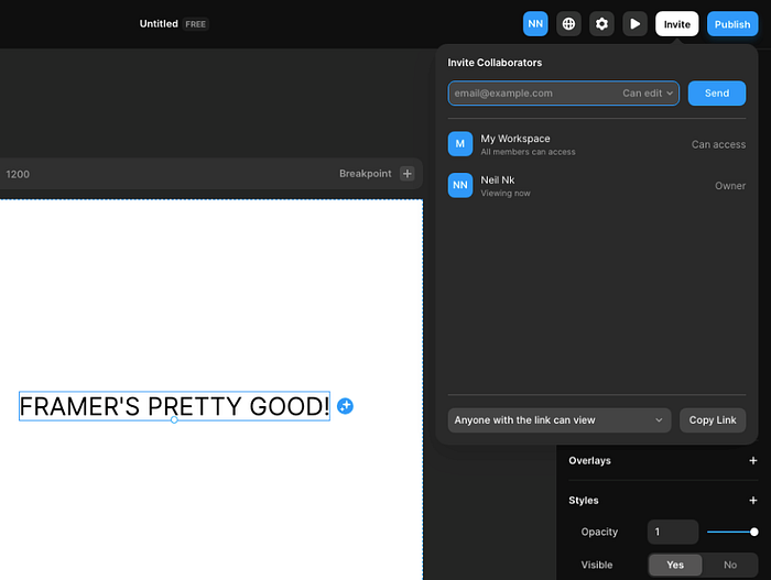
Unlike Figma, Framer doesn’t put much emphasis on collaborative design. There is a feature allowing you to share designs and prototypes with team members to receive feedback as well as allowing multiple team members to collaborate on the same canvas in real-time.
This is, however, not as extensive as Figma, which allows entire teams to collaborate on whole projects. Framer’s one-to-one collaboration is akin to what you’ll see on Google Drive, in which more than one person can work on one design at the same time. Which, for a lot of projects, is really all you’re going to need.
Design capabilities
Now, what can these platforms do? Framer is a lot more specialized.
Figma’s design functionalities
There’s a reason Figma stands out as one of the top 5 UI/UX design tools on the market. As a multi-purpose vector graphics editor, Figma’s modern pen tool, auto layout, and instant arc designs are among just a few unique features that make it stand out as a design platform:

Coupled with FigJam, its online platform for brainstorming and workshopping, Figma as an interface design tool sets itself apart from the competition. Especially since it’s browser-based, meaning that unlike other popular platforms like Sketch, which is only compatible with iOS, any web browser can access Figma.
Framer’s unique design features
While Framar outpaces a lot of these platforms in terms of animations and interactions, it also lacks some of the more standard elements that such platforms would need, such as the basic pen tool, the ability to group things together, and the concept of artboards. You can create components but you can’t create things like individual lines, nor can you group things, and artboards work differently:
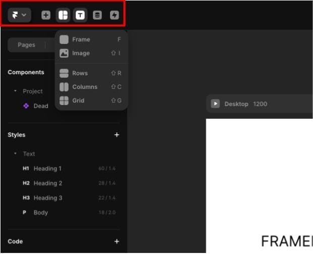
The pen tool is often not even used because it’s more of a minor inconvenience for a lot of people (not for me, though. I stay loyal to the pen!). Not being able to group things, however, is connected to the fact that artboards work differently.
Framer has Frames and not artboards, and anything in a Frame counts as a group. It’s quite confusing at first, but once you get used to not having groups, things work fine. Plus, you can always nest frames within each other to create makeshift groups if you need them.
Prototyping and animation
Here’s what you’ve been waiting for. Framar is an animation tool, after all. So is it worth venturing outside Figma for more detailed interactions?
Figma’s prototyping capabilities
As an all-purpose design tool, Figma of course has prototyping capabilities directly integrated into its intuitive UI:
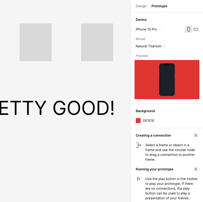
While it has standard prototyping features such as frame-to-frame transitions, it’s the other key features of Figma that truly make these features stand out. Thanks to the collaborative focus of Figma, it is easy for multiple people to collaborate and share one or more prototypes. Furthermore, its user-friendly UI makes it easy to use.
Framer’s advanced animation and prototyping features
Framer offers a host of assets, illustrations, and even smart components. Smart components include input fields for text, loading animation, sliders, and much more to create the interesting interactions that have become a cornerstone of UI design in recent years:

Not only are these components provided, but everything about their look and feel can be customized in Framer, and if you’re trying to do something particularly complicated, you can add code to further customize it. Furthermore, Framer’s magic motion gives a higher degree of control in regards to animation, allowing for control over things such as damping and more (some of these I haven’t even had the chance to use yet).
All of these are essential to creating incredibly intuitive porotypes that sets the platform apart from others and make up for the few features it lacks in terms of basic design capabilities. Furthermore, once complete, these prototypes can then be published to the web directly, which isn’t something you can do in Figma.
Integrations and plugins
Since one platform has more regular users, you might guess which has a greater plugin ecosystem. Let’s dive into how they contrast.
Figma’s extensive integrations and plugin ecosystem
Plugins are an essential part of any design workflow. They help make the design ecosystem more efficient which, is even more important when you keep in mind Figma’s collaboration-centric mission. The plugins integrate seamlessly into the UI, making them easy to use, and can help to meet the specific needs of a project:
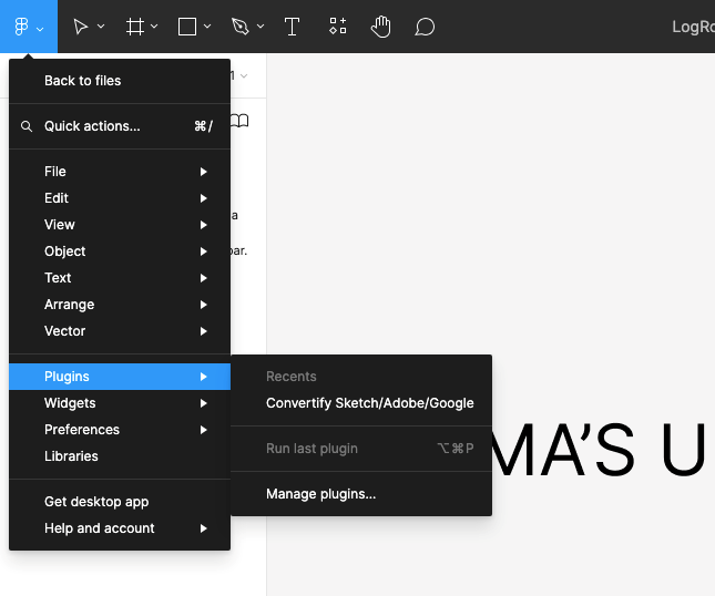
With its library of around 3000 integrations and plugins, you can simplify pretty much every part of your design process. Apart from the widely known plugins for finding icons, discovering images, removing backgrounds, and seamlessly importing Adobe Illustrator into Figma, there are also other plugins for more mundane tasks. These plugins can create consistency across all designs, automate minor tasks, detect errors, create dummy data, and much more.
Framer’s integrations and plugin support
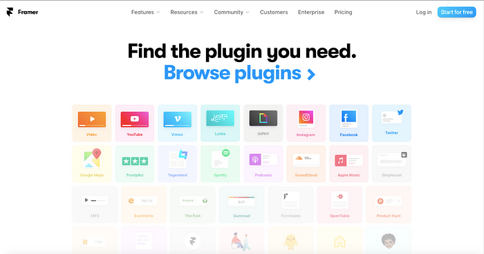
While Framer doesn’t come nearly as close to the 3000 integrations and plugins offered by Figma, it has its own plugins library with a bunch of essential interaction- and animation-focused plugins such as YouTube, Spotify, Google Maps, and many more. With its intuitive drag-and-drop feature, all of Framer’s plugins serve to supplement its advanced prototyping and interactive design features:
When to use Framer over Figma
Complex animations and interactions
Projects that require advanced animations and microinteractions are best suited for Framer. Its intricate animation editor allows for a high level of control in these areas, a unique and interactive UI that goes above and beyond what platforms such as Figma can create.
This creates an emphasis on small details, which further enhance a user’s experience. Simple things such as feedback animations and hover effects have been shown to have a huge effect on how a user navigates a UI, and Framer’s high level of control over these interactions, as well as the ability to further innovate and create your own through code, sets this platform apart in this field.
Designing high-level prototypes
Framer’s animation and interaction capabilities are supplemented with its vast library of UI kits. This makes the prototyping process much easier and mimics very closely how the project would appear in its final instance. This means Framer works well for projects where a high level of fidelity is required, rather than creating a prototype to give clients a basic idea of how the app would work.
Framer’s high-level capabilities can closely mimic how specific platforms such as iOS or Android would integrate the design. This makes it easier to create prototypes that more closely meet the intended user experience, and if not, can be more accurately tested. This is incredibly important for projects that require specific platform guidelines (for example, projects that are specifically intended for iOS or Android, which both have their own UI/UX guidelines that need to be followed).
Conclusion
While both Figma and Framer have their strengths and weaknesses, Framer’s selling point and the areas in which it exceeds Figma are found in prototyping, and the manipulation of animations and microinteractions for creative, intuitive design. Some have even called Framer a prototyping tool in which you can code and design rather than an all-purpose design tool like Figma.
For designers specialized in prototyping or projects that require it at a higher level, Framer is your go-to. Designers who are focused on the little details involving complex animations and interactions to push the boundaries of intuitive design should consider trying this platform. Meanwhile, general design projects that require high levels of team collaboration, as well as strong design tools, should use Figma.
At the end of the day, both tools serve to help designers improve their design workflow with a focus on two different areas, and both have their merits as design platforms that when used in tandem create fantastic projects.
